2. Plotting Functions
PyModulon contains a suite of plotting functions for data visualization and iModulon characterization.
[1]:
from pymodulon.plotting import *
from pymodulon.example_data import load_ecoli_data
[2]:
ica_data = load_ecoli_data()
2.1. Bar plots
Gene expression and iModulon activities are easily viewed as bar plots. Use the plot_expression and plot_activities functions, respectively. Any numeric metadata for your experiments can be plotted using the plot_metadata function.
Optional arguments:
projects: Only show specific project(s)highlight: Show individiual conditions for specific project(s)ax: Use a pre-existing matplotlib axis (helpful if you want to manually determine the plot size).legend_args: Dictionary of arguments to pass to the matplotlib legend (e.g.{'fontsize':12, 'loc':0, 'ncol':2})
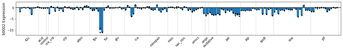
2.1.1. Plot Gene Expression
You can plot the compendium-wide expression of a gene using either the locus tag or gene name. Each bar represents an experimental condition, and points are overlaid on the bars to show the gene expression of individual replicates. The plot is subdivided into projects, as stored in the sample_table.
[3]:
plot_expression(ica_data,'b0002');
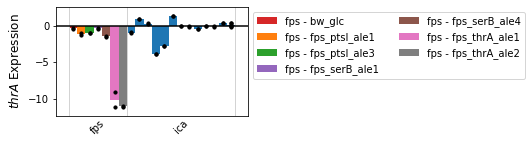
The plot can be limited to specific projects using the projects argument. The highlight argument shows individual conditions in the legend.
[4]:
plot_expression(ica_data,'thrA',projects=['ica','fps'],highlight='fps');
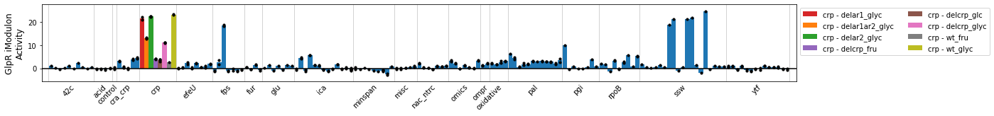
2.1.2. Plot iModulon Activities
The plot_activities function mirrors the plot_expression function, but shows iModulon activities instead of gene expression.
[5]:
plot_activities(ica_data,'GlpR',highlight='crp');
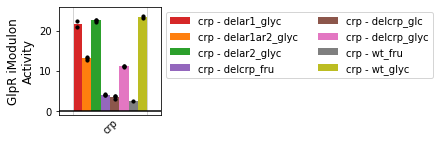
[6]:
plot_activities(ica_data,'GlpR',projects='crp');
2.1.3. Plot sample metadata
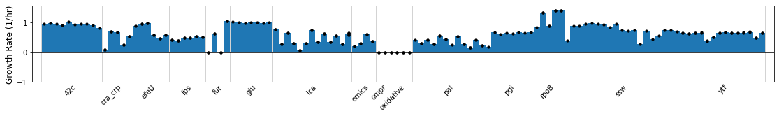
If the sample_table contains numerical values in a column, this column can be graphed using the plot_metadata function.
[7]:
plot_metadata(ica_data,'Growth Rate (1/hr)');
2.2. Scatterplots
Gene expression and iModulon activities can be compared with a scatter plot. Use the compare_expression and compare_activities functions, respectively. In addition, compare_values can be used to compare any compendium-wide value against another, including gene expression, iModulon activity, and sample metadata.
Optional arguments:
groups: Mapping of samples to specific groupscolors: Color of points, list of colors to use for different groups, or dictionary mapping groups to colorsshow_labels: Show labels for points. (default:False)adjust_labels: Automatically avoid label overlapfit_metric: Correlation metric of'pearson','spearman', or'r2adj'(default:'pearson')ax: Use a pre-existing axis (helpful if you want to manually determine the plot size)
Formatting arguments:
ax_font_args: Arguments for x-axis labels and y-axis labels (e.g.{'fontsize':16'})scatter_args: Arguments for matplotlib scatterplot (e.g.{'s'=10})label_font_args: Arguments for matplotlib text labels (e.g.{'fontsize':8})legend_args: Arguments to pass to the matplotlib legend (e.g.{'fontsize':12, 'loc':0, 'ncol':2})
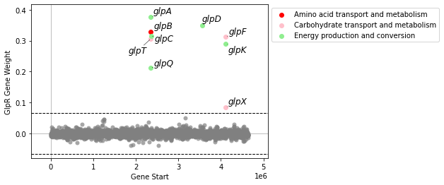
2.2.1. Plot gene weights
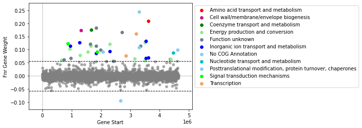
plot_gene_weights will plot an iModulon’s gene weights against its genomic position. If the number of genes in the iModulon is fewer than 20, it will also show the gene names (or locus tags, if gene name is unavailable). If the gene_table contains a COG column, genes will be colored by their Cluster of Orthologous Genes category.
[8]:
plot_gene_weights(ica_data,'GlpR')
[8]:
<AxesSubplot:xlabel='Gene Start', ylabel='GlpR Gene Weight'>
If there are more than 20 genes, gene names will not be shown by default.
[9]:
plot_gene_weights(ica_data,'Fnr')
[9]:
<AxesSubplot:xlabel='Gene Start', ylabel='Fnr Gene Weight'>
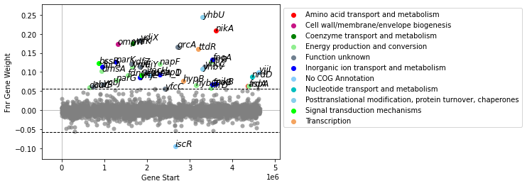
Use show_labels=True show gene labels. It is advisable to turn of auto-adjustment of gene labels (adjust_labels=False), as this may take a while with many genes.
[10]:
plot_gene_weights(ica_data,'Fnr',show_labels=True,adjust_labels=False)
[10]:
<AxesSubplot:xlabel='Gene Start', ylabel='Fnr Gene Weight'>
2.2.2. Compare two gene expression profiles
The compare_expression function plots two iModulon activities against each other. Groups of samples can be highlighted to visualize the effects of experimental conditions.
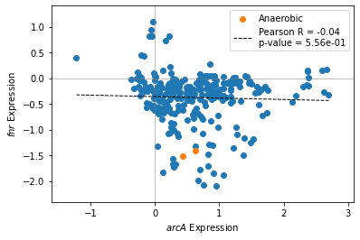
[11]:
groups = {'minspan__wt_glc_anaero__1':'Anaerobic',
          'minspan__wt_glc_anaero__2':'Anaerobic'}
[12]:
compare_expression(ica_data,'arcA','fnr',groups=groups)
[12]:
<AxesSubplot:xlabel='$arcA$ Expression', ylabel='$fnr$ Expression'>
2.2.3. Compare two iModulon activities
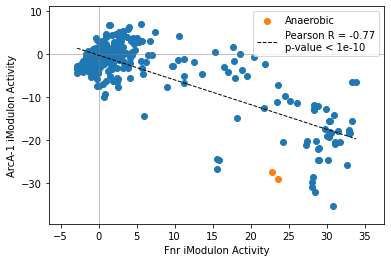
The compare_activities function mirrors the compare_expression function.
[13]:
compare_activities(ica_data,'Fnr','ArcA-1',groups=groups)
[13]:
<AxesSubplot:xlabel='Fnr iModulon Activity', ylabel='ArcA-1 iModulon Activity'>
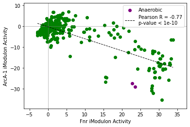
[14]:
compare_activities(ica_data,'Fnr','ArcA-1',groups=groups,colors=['green','purple'])
[14]:
<AxesSubplot:xlabel='Fnr iModulon Activity', ylabel='ArcA-1 iModulon Activity'>
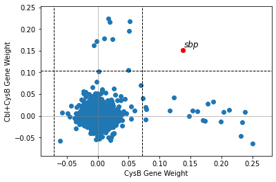
2.2.4. Compare iModulon gene weights
compare_gene_weights plots the gene weights of two iModulons against each other. Dashed lines indicate iModulon thresholds. Genes outside both thresholds are highlighted in red and labelled.
[15]:
compare_gene_weights(ica_data,'CysB','Cbl+CysB')
[15]:
<AxesSubplot:xlabel='CysB Gene Weight', ylabel='Cbl+CysB Gene Weight'>
2.2.5. Differential iModulon activity
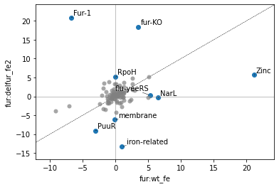
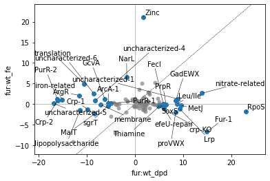
A Differential iModulon Activity plot, or DiMA plot shows iModulons that have significantly different iModulon activities between two experimental conditions. The plot_dima function can either compare two conditions using project:condition keys, or using a list of sample names.
[16]:
plot_dima(ica_data,'fur:wt_fe','fur:delfur_fe2')
/home/docs/checkouts/readthedocs.org/user_builds/pymodulon/envs/stable/lib/python3.7/site-packages/pymodulon/util.py:174: PerformanceWarning: DataFrame is highly fragmented.  This is usually the result of calling `frame.insert` many times, which has poor performance.  Consider joining all columns at once using pd.concat(axis=1) instead.  To get a de-fragmented frame, use `newframe = frame.copy()`
  _diff[":".join(name)] = abs(A_to_use[i1] - A_to_use[i2])
[16]:
<AxesSubplot:xlabel='fur:wt_fe', ylabel='fur:delfur_fe2'>
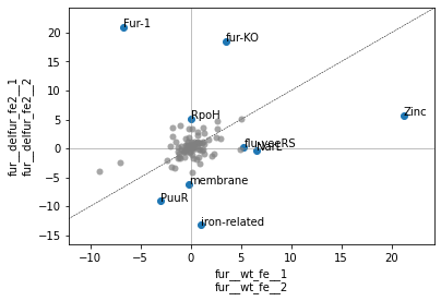
table=Trueadjust=False[17]:
ax, table = plot_dima(ica_data,
          ['fur__wt_fe__1','fur__wt_fe__2'],
          ['fur__delfur_fe2__1','fur__delfur_fe2__2'],
          table=True,
          adjust=False)
table
[17]:
| difference | pvalue | qvalue | 0 | 1 | |
|---|---|---|---|---|---|
| Fur-1 | 27.598965 | 7.320594e-04 | 0.011225 | -6.701019 | 20.897946 |
| fur-KO | 14.918007 | 4.338664e-08 | 0.000004 | 3.516092 | 18.434098 |
| RpoH | 5.145175 | 3.091958e-03 | 0.031607 | 0.008680 | 5.153855 |
| flu-yeeRS | -5.020887 | 2.246638e-04 | 0.006612 | 5.299051 | 0.278164 |
| membrane | -6.005727 | 5.390713e-05 | 0.002480 | -0.163181 | -6.168908 |
| PuuR | -6.026142 | 1.397577e-03 | 0.017874 | -3.040374 | -9.066517 |
| NarL | -6.873706 | 4.898118e-03 | 0.040966 | 6.520503 | -0.353203 |
| iron-related | -14.209552 | 2.874857e-04 | 0.006612 | 1.004311 | -13.205241 |
| Zinc | -15.497242 | 5.238034e-04 | 0.009638 | 21.181402 | 5.684160 |
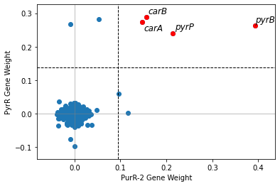
2.2.6. Compare iModulon gene weights across organisms
In order to compare gene weights across organisms, you will need the IcaData objects for both organisms, as well as a file mapping the genes between the organisms. To generate this file, see the Comparing iModulons tutorial.
[18]:
from pymodulon.example_data import load_staph_data, load_example_bbh
staph_data = load_staph_data()
bbh = load_example_bbh()
[19]:
compare_gene_weights(ica_data,'PurR-2',
                     ica_data2 = staph_data,
                     imodulon2 = 'PyrR',
                     ortho_file = bbh)
[19]:
<AxesSubplot:xlabel='PurR-2 Gene Weight', ylabel='PyrR Gene Weight'>

Use use_org1_names to switch which organism’s gene names are shown.
[20]:
compare_gene_weights(ica_data,'PurR-2',
                     ica_data2 = staph_data,
                     imodulon2 = 'PyrR',
                     ortho_file = bbh,
                     use_org1_names = False)
[20]:
<AxesSubplot:xlabel='PurR-2 Gene Weight', ylabel='PyrR Gene Weight'>
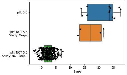
2.3. Automated metadata classification
The function metadata_boxplot automatically classify iModulon activities given metadata information. Optional arguments include:
show_points: Overlay individual points on top of the boxplot. By default, this is True, and uses a stripplot.show_points='swarm'will use a swarmplot.n_boxes: Number of boxes to createsample: Subset of samples to analyzestrip_conc: Remove concentrations from metadata (e.g. “glucose(2g/L)” would be interpreted as just “glucose”). Default isTrue.ignore_cols: List of columns to ignore. If empty, onlyprojectandconditionare ignored.use_cols: List of columns to use. This supercedesignore_cols.return_results: Return a DataFrame describing the classifications.
[21]:
metadata_boxplot(ica_data,"EvgA",ignore_cols=['GEO','study','project','DOI']);
/home/docs/checkouts/readthedocs.org/user_builds/pymodulon/envs/stable/lib/python3.7/site-packages/sklearn/tree/_classes.py:370: FutureWarning: Criterion 'mae' was deprecated in v1.0 and will be removed in version 1.2. Use `criterion='absolute_error'` which is equivalent.
  FutureWarning,
The use_cols argument selects which columns to use from the sample_table.
To turn off individual points, set show_points=False. Alternatively, show_points='swarm' will use a swarmplot.
[22]:
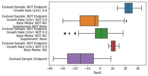
metadata_boxplot(ica_data,"RpoS",n_boxes=5,
                 use_cols=['Base Media','Carbon Source (g/L)',
                           'Nitrogen Source (g/L)','Supplement',
                           'Evolved Sample','pH','Growth Rate (1/hr)'],
                 show_points=False);
/home/docs/checkouts/readthedocs.org/user_builds/pymodulon/envs/stable/lib/python3.7/site-packages/sklearn/tree/_classes.py:370: FutureWarning: Criterion 'mae' was deprecated in v1.0 and will be removed in version 1.2. Use `criterion='absolute_error'` which is equivalent.
  FutureWarning,
The samples argument selects specific samples to plot
The strip_kwargs argument can be used to customize the stripplot
[23]:
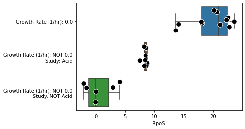
metadata_boxplot(ica_data,"RpoS",
                 n_boxes=3,
                 samples=ica_data.sample_names[:26],
                 ignore_cols = ['DOI','GEO'],
                 strip_kwargs={'size':10, 'edgecolor':'white', 'linewidth':1});
/home/docs/checkouts/readthedocs.org/user_builds/pymodulon/envs/stable/lib/python3.7/site-packages/sklearn/tree/_classes.py:370: FutureWarning: Criterion 'mae' was deprecated in v1.0 and will be removed in version 1.2. Use `criterion='absolute_error'` which is equivalent.
  FutureWarning,
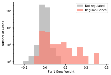
2.4. iModulon histograms
iModulon gene weights can be visualized in a histogram. If you wish to highlight genes in a regulon, it can be visualized either as overlapping bars, or side-by-side bars.
[24]:
plot_regulon_histogram(ica_data,'Fur-1','fur')
[24]:
<AxesSubplot:xlabel='Fur-1 Gene Weight', ylabel='Number of Genes'>
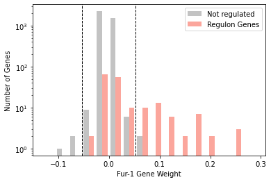
[25]:
plot_regulon_histogram(ica_data,'Fur-1','fur',kind='side')
[25]:
<AxesSubplot:xlabel='Fur-1 Gene Weight', ylabel='Number of Genes'>
2.5. Overview plots
PyModulon contains two plots to help gain a general overview of your IcaData object.
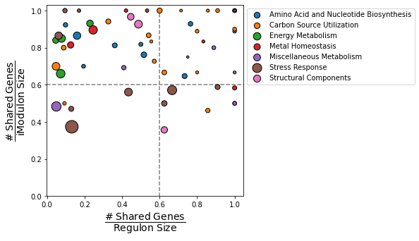
2.5.1. Compare iModulons vs Regulons
compare_imodulon_vs_regulon creates a scatter plot that compares the overlap between iModulons and their linked regulators. The dashed lines creates four quadrants:
Top-right: iModulons that are nearly identical to known regulons (“Well-matched”)
Top-left: iModulons contain a subset of the total genes thought to be regulated by the linked regulator (“Subset”)
Bottom-right: iModulons contain most of the genes thought to be regulated by the linked regulator. However, these iModulons contain a high fraction of genes that are not yet confirmed to be regulated by the regulator (“Unknown-containing”).
Bottom-left: iModulons have a small, but statistically significant, overlap with the associated regulator (“Closest match”)
Additional options include:
imodulons: List of iModulons to plotcat_column: Column in the `imodulon_tablethat stores the category of each iModulonsize_column: Column in theimodulon_tablethat stores the size of each iModulonscale: Value used to scale the size of each pointreg_only: Only plot iModulons with an entry in theregulatorcolumn of theimodulon_tablexlabel: Custom x-axis label (default: “# shared genes/Regulon size”)ylabel: Custom y-axis label (default: “# shared genes/iModulon size”)vline: Draw a dashed vertical linehline: Draw a dashed horizontal line
[26]:
compare_imodulons_vs_regulons(ica_data,
                              size_column='n_genes',
                              cat_column='Category',
                              scale=3);
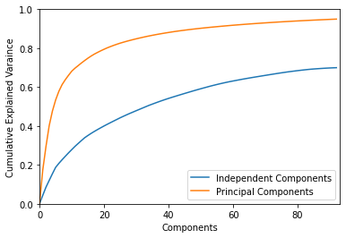
2.5.2. Plot explained variance
plot_explained_variance gives an idea of how much of the expression variation is captured by iModulons
[27]:
plot_explained_variance(ica_data);
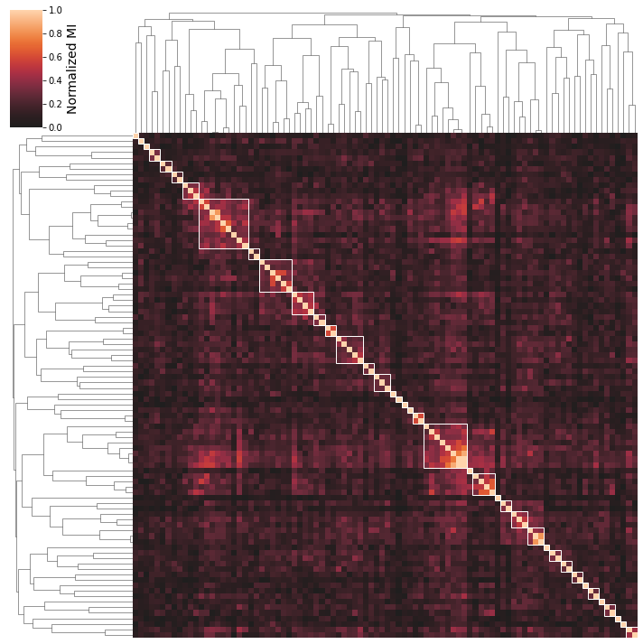
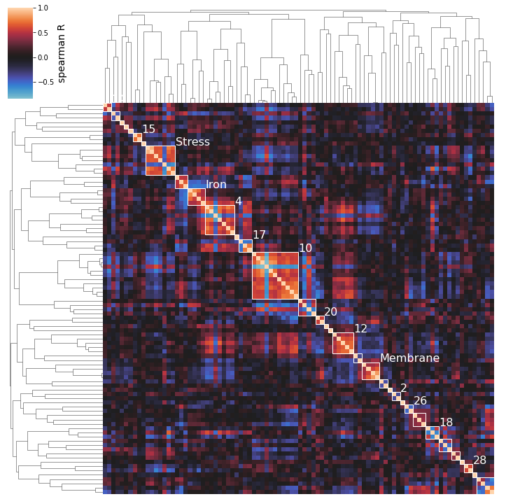
2.6. Activity Clustering
The iModulon activites in the A matrix can be clustered based on correlation between their activities across conditions in the compendium.
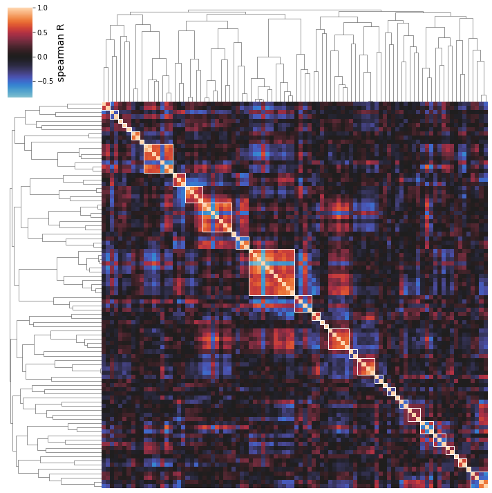
Use the cluster_activities function to prepare a clustermap; the minimal input is simply your IcaData object.
[28]:
cluster_activities(ica_data);

2.6.1. Using different correlation metrics
You can use multiple correlation metrics, including "pearson","spearman", and "mutual_info". Mutual information is most likely to identify biologically similar iModulons, but can be more difficult to interpret as it finds both linear and non-linear correlations.
[29]:
cluster_activities(ica_data,correlation_method='mutual_info');
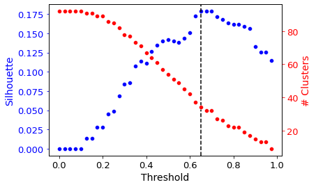
2.6.2. Automatic Distance Thresholding
Agglomerative (hierarchical) clustering is used under the hood. Thus, a distance threshold for defining “flat” clusters from the hierarchical structure must be determined. By default, this distance threshold is automagically calculated using a sensitivity analysis.
Different distance thresholds (this value is between 0 and 1) are tried, and the resulting clustering is assessed using a silhouette score (a measure of how separate the clusters are). The distance threshold yielding the maximum silhouette score is automatically chosen.
To see the result of this sensitivity analysis, use the show_thresholding option.
[30]:
cluster_activities(ica_data, show_thresholding=True);
2.6.3. Manual Distance Threshold
You may also determine that you’re interested in manually varying the distance threshold to see what happens to the iModulon clusters. Setting this threshold manually (with the distance_threshold option) will override the automatic thresholding shown above.
Note: distance_threshold must be set to a value between 0 and 1; larger values will generally yield smaller numbers of larger clusters, as shown in the thresholding plot above.
[31]:
cluster_activities(ica_data, distance_threshold=0.95);

2.6.4. Displaying Best Clusters
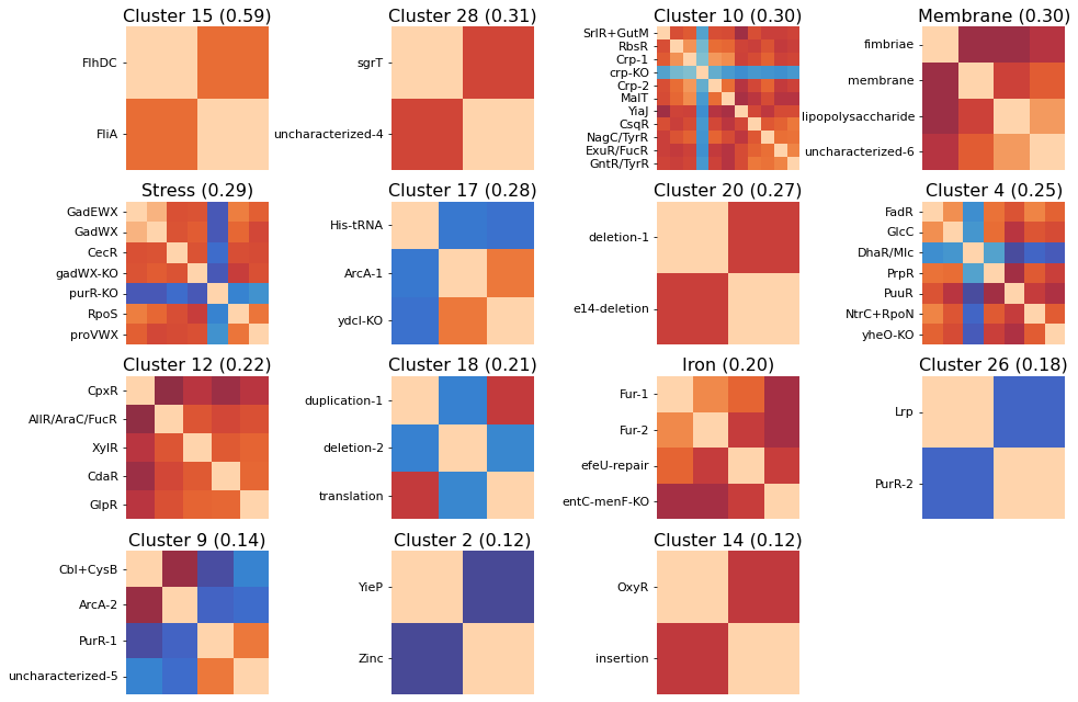
The above clustermaps do not allow you to see which iModulons are actually being clustered together; use the show_best_clusters option to call out an additional plot that shows such clusters.
By default, the clusters whose individual silhouette scores are greater than the mean silhouette score (indicating their separation from the other clusters is above-average) will be shown.
The cluster numbers come from the scikit-learn AgglomerativeClustering estimator that actually performs the clustering; these labels don’t have any special significance and are just unique identifiers for each cluster. You can also access an iModulon-index-matched list of these labels by accessing the labels_ attribute of the AgglomerativeClustering object (which is returned by cluster_activities).
[32]:
cluster_activities(ica_data, show_best_clusters=True);

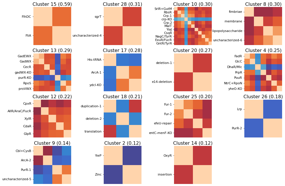
So we can see here that the clustering method does seem to capture some biologically-relevant groups of iModulons: Cluster 15 contains 2 flagella regulators, Cluster 8 is membrane-related, Cluster 13 is stress-related, Cluster 25 is iron-related, Cluster 12 is carbon metabolism related, etc.
NOTE: the parenthesized numbers next to the cluster names are the clusters’ silhouette scores (a 0 to 1 measure of a cluster’s separation from the pack).
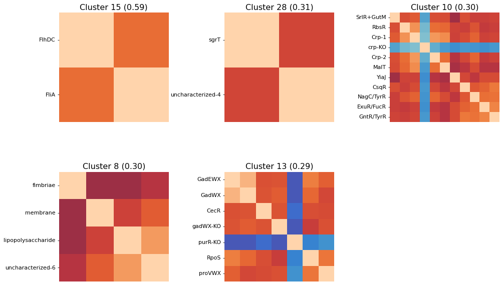
Perhaps you’re only interested in seeing a specific number of the top clusters; use the n_best_clusters argument to specify this preference:
[33]:
cluster_activities(ica_data, show_best_clusters=True, n_best_clusters=5);

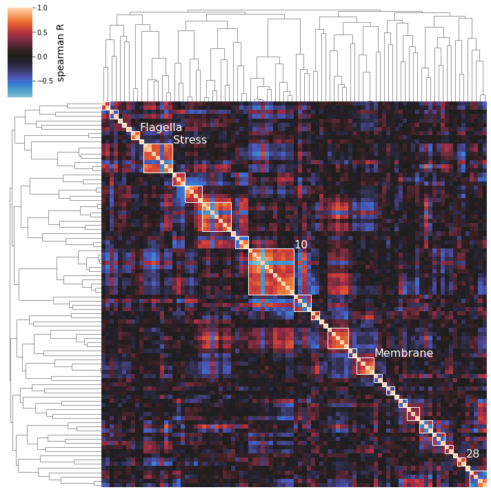
2.6.5. Naming Clusters
After performing an initial clustering and manually mapping knowledge onto your best clusters, you may decide on a new, more descriptive name for some of your clusters. To generate pretty figures that use these names instead of the soulless integer IDs, use the cluster_names option to map the integer IDs to names. You don’t have to rename all clusters.
[34]:
cluster_activities(
    ica_data, show_best_clusters=True, n_best_clusters=5,
    cluster_names={15: 'Flagella', 8: 'Membrane', 13: 'Stress'}
);

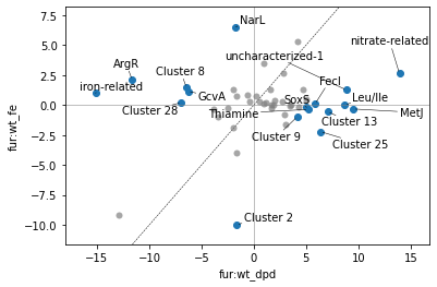
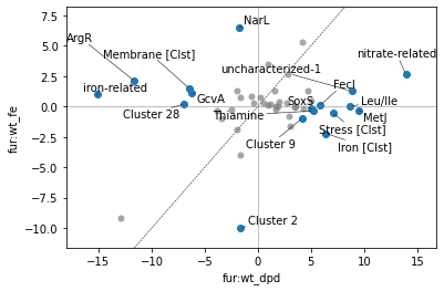
2.6.6. DIMCA
Differential iModulon Cluster Activity (DIMCA) analysis, a sister method to the differential iModulon activity (DIMA) analysis, allows you to compare all iModulon activities between 2 or more conditions.
cluster_activities itself has the capability to perform DIMCA analyses, exposing a series of dimca_-prefixed arguments that correspond with the arguments to plot_dima (which is in fact used under the hood).
For DIMCA, a “cluster activity” will be calculated for each of your best clusters (however many you ask for) and then plotted between your 2 conditions, instead of that cluster’s constituent iModulons. In this way, a DIMA plot can be rendered even simpler.
Cluster activities are simply the averages of the activities of the constituent iModulons, EXCEPT that for iModulons that are generally anti-correlated with the others in a cluster (see purR-KO from the above plot, for example), the sign of the activities is first switched.
[35]:
plot_dima(ica_data, 'fur:wt_dpd', 'fur:wt_fe');
/home/docs/checkouts/readthedocs.org/user_builds/pymodulon/envs/stable/lib/python3.7/site-packages/pymodulon/util.py:174: PerformanceWarning: DataFrame is highly fragmented.  This is usually the result of calling `frame.insert` many times, which has poor performance.  Consider joining all columns at once using pd.concat(axis=1) instead.  To get a de-fragmented frame, use `newframe = frame.copy()`
  _diff[":".join(name)] = abs(A_to_use[i1] - A_to_use[i2])
This DIMA plot is fairly busy; we can use DIMCA to reduce the number of points even further:
[36]:
cluster_activities(ica_data, show_best_clusters=True, dimca_sample1='fur:wt_dpd', dimca_sample2='fur:wt_fe');

/home/docs/checkouts/readthedocs.org/user_builds/pymodulon/envs/stable/lib/python3.7/site-packages/pymodulon/util.py:174: PerformanceWarning: DataFrame is highly fragmented.  This is usually the result of calling `frame.insert` many times, which has poor performance.  Consider joining all columns at once using pd.concat(axis=1) instead.  To get a de-fragmented frame, use `newframe = frame.copy()`
  _diff[":".join(name)] = abs(A_to_use[i1] - A_to_use[i2])

Thus, we have a somewhat simpler picture of this comparison. We can increase the number of best clusters we ask for to yield only cluster points; be careful with this though, as some of the worse-scoring clusters are actually “singleton” clusters with just a single iModulon in them (for these iModulons’ activities are generally uncorrelated with the other iModulons in the dataset).
[37]:
cluster_activities(ica_data, n_best_clusters=50, dimca_sample1='fur:wt_dpd', dimca_sample2='fur:wt_fe');

/home/docs/checkouts/readthedocs.org/user_builds/pymodulon/envs/stable/lib/python3.7/site-packages/pymodulon/util.py:174: PerformanceWarning: DataFrame is highly fragmented.  This is usually the result of calling `frame.insert` many times, which has poor performance.  Consider joining all columns at once using pd.concat(axis=1) instead.  To get a de-fragmented frame, use `newframe = frame.copy()`
  _diff[":".join(name)] = abs(A_to_use[i1] - A_to_use[i2])
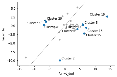
And as before, if we name clusters, those names will propagate to the DIMCA plot (and DIMCA table if requested):
[38]:
cluster_obj, dimca_ax, table = cluster_activities(
    ica_data, show_best_clusters=True,
    cluster_names={25: 'Iron', 13: 'Stress', 8: 'Membrane'},
    dimca_sample1='fur:wt_dpd', dimca_sample2='fur:wt_fe', dimca_table=True
);
/home/docs/checkouts/readthedocs.org/user_builds/pymodulon/envs/stable/lib/python3.7/site-packages/pymodulon/util.py:174: PerformanceWarning: DataFrame is highly fragmented.  This is usually the result of calling `frame.insert` many times, which has poor performance.  Consider joining all columns at once using pd.concat(axis=1) instead.  To get a de-fragmented frame, use `newframe = frame.copy()`
  _diff[":".join(name)] = abs(A_to_use[i1] - A_to_use[i2])
[39]:
table
[39]:
| difference | pvalue | qvalue | 0 | 1 | |
|---|---|---|---|---|---|
| iron-related | 16.153595 | 0.000168 | 0.001971 | -15.149284 | 1.004311 |
| ArgR | 13.753341 | 0.002044 | 0.005877 | -11.636817 | 2.116524 |
| NarL | 8.227232 | 0.002884 | 0.007045 | -1.706729 | 6.520503 |
| Membrane [Clst] | 7.906679 | 0.001441 | 0.004514 | -6.433855 | 1.472824 |
| GcvA | 7.412801 | 0.000035 | 0.000823 | -6.265427 | 1.147374 |
| Cluster 28 | 7.156066 | 0.000250 | 0.002347 | -6.943347 | 0.212719 |
| Cluster 9 | -5.126362 | 0.000456 | 0.002925 | 4.132141 | -0.994221 |
| SoxS | -5.226992 | 0.000665 | 0.003127 | 5.043639 | -0.183353 |
| Thiamine | -5.558917 | 0.003923 | 0.007682 | 5.193298 | -0.365619 |
| FecI | -5.760403 | 0.001402 | 0.004514 | 5.871660 | 0.111257 |
| uncharacterized-1 | -7.566460 | 0.000498 | 0.002925 | 8.833006 | 1.266546 |
| Stress [Clst] | -7.639391 | 0.000619 | 0.003127 | 7.081778 | -0.557613 |
| Cluster 2 | -8.318706 | 0.000114 | 0.001783 | -1.638389 | -9.957095 |
| Iron [Clst] | -8.611146 | 0.003289 | 0.007045 | 6.395635 | -2.215511 |
| Leu/Ile | -8.702352 | 0.000850 | 0.003633 | 8.712151 | 0.009800 |
| MetJ | -9.857605 | 0.000403 | 0.002925 | 9.533284 | -0.324320 |
| nitrate-related | -11.292903 | 0.000002 | 0.000097 | 13.926154 | 2.633251 |
Note that [Clst] is added to cluster names in the DIMCA plot to avoid confusion with unclustered iModulons.